Standing in front of a wall of fabric with a pattern in your hand is the part of quilting that stops people. Not the sewing. The choosing. And most of the worry goes into the wrong question, because the thing that decides whether a quilt reads properly is not which colours you picked. It is how light and how dark they are next to each other.
Value is the part that does the work
Value is simply how light or dark a fabric is. A star only looks like a star because the fabric in the star is a different value from the fabric around it. Get that right and almost any colours will work. Get it wrong and the most beautiful fabrics in the shop will produce a quilt where the design disappears.
The part that catches people out is that value is not a property a fabric owns. Kim Jamieson-Hirst of Chatterbox Quilts puts it exactly: a fabric can be a light, a dark or a medium depending on what other fabrics you put it with. The same green is the dark one beside cream and the light one beside navy. So there is no point sorting your stash into lights and darks in the abstract. It only means anything once two fabrics are lying next to each other.
Chelsea Stratton, of the A Quilting Life podcast, gives the rule that follows from it: "You don't want two dark prints together because they're just going to muddy together. Where you do a dark and something lighter and have a good contrast is how I would do it." Two darks side by side do not read as two fabrics. They read as one slightly confused shape.
The test that costs nothing
You already own the tool that settles this. Lay the fabrics you are considering next to each other and photograph them with your phone in black and white. Most phone cameras have a mono filter built into the camera app.
With the colour stripped out, only value is left. Two fabrics that looked obviously different can turn out to read the same, usually because the print was doing the work rather than the value. Kim Jamieson-Hirst uses this constantly for exactly that reason, and makes a point that is worth repeating: everybody sees colour a little differently, and it becomes more noticeable as your eyes get older. The camera does not have that problem.
Sheri McConnell of A Quilting Life does the same thing before committing: photograph the fabrics you are about to put in a block together, and see whether anything jumps out at you.
It takes ten seconds and it is the single most useful habit in this whole article.
Contrast is not one setting
Beginners are usually told to have good contrast, full stop. That is only half right, because different parts of a quilt want different amounts.
Where the design has to read, you want the contrast obvious. The star, the diamond, the geese, whatever the pattern is built on, has to separate from what surrounds it or the block turns into texture.
Where the background lives, you want the opposite. Kim Jamieson-Hirst describes choosing two background fabrics for one of her own quilts and wanting "a little bit of a contrast, but not a huge contrast" between them, so that they "recede in the background. You can certainly see them, but they don't detract from those diamonds that pop off that quilt." She had tried lighter backgrounds first and rejected them, because they drew attention away from the diamonds.
That is the useful correction. A background is not there to be seen. It is there so that the thing in front of it can be.
The background deserves a decision
Most first quilts treat the background as whatever is left over. It is worth more thought than that, for two reasons.
The first is rest. Sheri McConnell puts it as needing "plenty of resting space for my eyes", and describes a quilt with plenty of open white in it as having a calming effect that lets the busy, happy parts be busy and happy. A quilt where every inch is working is exhausting to look at.
The second is practical and almost nobody mentions it. A plain background is where your quilting will actually show. If you have any intention of the stitching being seen, that is decided at the point you pick the background, not later.
A solid is the safest way to do this, because a solid has one value and cannot surprise you. Our Solids collection is there for exactly this job.
Texture, which is really print scale
Once value is settled, the prints themselves matter less than people expect. Kim Jamieson-Hirst, choosing between a batik and a polka dot for the same position, concluded that either would work, because they were much the same colour. The print style was not the deciding factor. The value was.
What does cause trouble is putting two busy prints of a similar scale next to each other. In her words, there is "too much fabric, too much pattern going on there". Vary the scale instead: a large print, a small print, and something that reads as plain. A small enough print behaves like a solid from a few feet away, which is a useful thing to know when you want the calm of a solid but not the flatness.
The shortcut that removes most of this
Everything above assumes you are choosing fabrics one at a time. You do not have to.
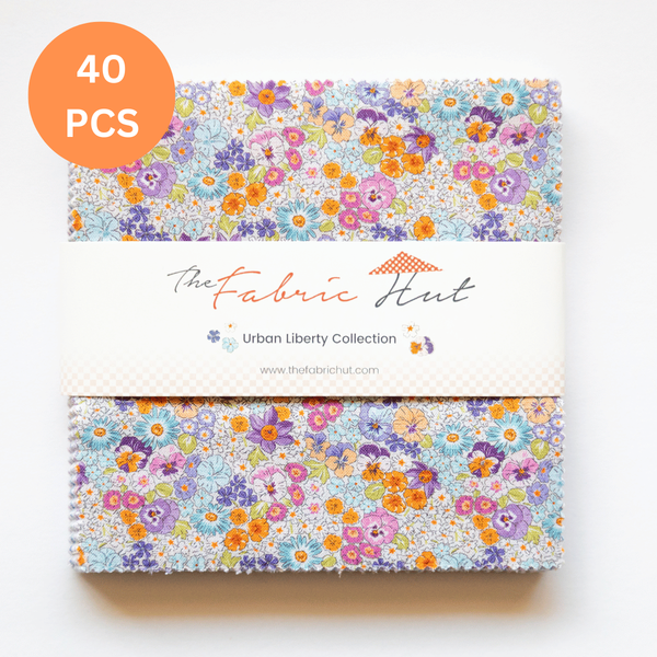
A fabric collection is a group of prints designed together by one designer, in one palette, with the light, medium and dark range already built in and the scales already varied. Buying a precut from a single collection means someone whose job is colour has already done the work.
That is why we suggest starting there for a first quilt:
- Charm Packs, 5 inch squares, the smallest way to own a whole collection
- Layer Cakes, 10 inch squares, the same idea with fewer seams
- Jelly Rolls and Strip Rolls, 2 1/2 inch strips, for anything built from rows
- The wider Pre-Cut Fabric range if you want to mix formats
One caveat worth knowing. A quilt made entirely from one collection can come out looking a little too settled, because everything in it was chosen to agree. If that happens, the usual fix is to bring in one fabric from outside it, often a solid, to give the eye somewhere to land.
A second opinion on value and texture
Magic Little Dream Quilts covers the same ground on her channel, working through value, colour and texture with fabric in hand rather than on paper. If you would rather see it than read it, it is a good watch.
The short version
- Judge value before colour. Light, medium, dark is what makes the design read.
- Nothing is light or dark on its own. It only becomes one next to something else.
- Photograph your choices in black and white before you cut. Ten seconds, no cost.
- Big contrast where the pattern has to show. Small contrast where the background should sit quietly.
- Pick the background on purpose, and remember it is where the quilting will show.
- Vary the scale of the prints, not just the colours.
- If in doubt, buy one collection and let the designer's palette do the work.
If this is your first quilt and you want the whole path rather than just the fabric decision, we wrote it out: how to make a quilt, a complete step by step guide for beginners.
Quotes in this article come from Kim Jamieson-Hirst of Chatterbox Quilts, and from Sheri McConnell and Chelsea Stratton of the A Quilting Life podcast. The video is by Magic Little Dream Quilts.